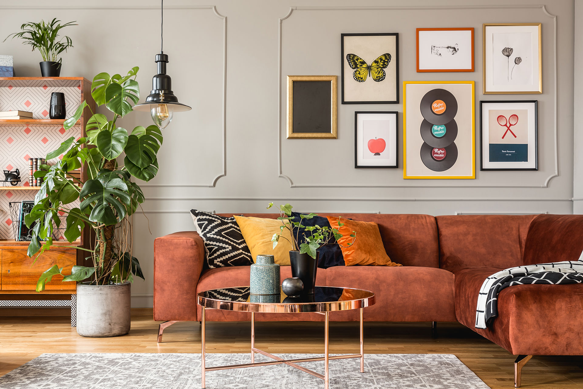
I tried almost every 8×10 photo wall display idea before I found the one that actually worked for my home.
For months, my hallway wall stayed empty.
Cold. Forgettable. Like nobody even lived there.
I had hundreds of photos saved on my phone, but not a single one on the walls telling our story.
Then I realized something most people get wrong: you don’t need giant canvases or a fortune at a frame shop to make a wall look magazine-worthy.
You just need the right 8×10 layout.
This size is the sweet spot nobody talks about enough.
Big enough that faces and little details actually show up from across the room.
Small enough that one bad placement doesn’t ruin your entire wall.
I’ve hung dozens of these, in my own house and for friends who wanted that same warm, put-together look without hiring a designer.
The reaction is always the same.
“Wait… these are just 8×10 frames?”
If you’re standing in front of a blank wall right now, feeling stuck, you’re not alone.
Maybe Pinterest already burned you once, and your “inspired” gallery wall ended up looking more like a mismatched puzzle.
Or maybe the fear of nail holes in the wrong spot has kept you from starting at all.
Either way, that ends today.
I’m walking you through 8×10 photo wall display ideas for every single room in your home, so you can finally pick a layout that fits your space instead of copying one that only worked in someone else’s.
Why 8×10 Photos Are the Perfect Size for Wall Displays
Every home decor question eventually comes back to the same thing: proportion.
That’s exactly why the 8×10 photo wall display idea works so consistently well, no matter the room.
It’s not a random size.
Art galleries and interior designers have used 8×10 as a baseline for decades, mostly because it hits a sweet spot between visibility and flexibility.
Too small, and details get lost from across the room.
Too large, and one bad placement throws off an entire wall.
There’s actual science behind hanging height too, not just style preference.
Interior designers generally agree that the center of any wall display should sit somewhere between 57 and 60 inches from the floor, since that lines up with average eye level for most adults standing in a room.
I’ve used that number on nearly every wall I’ve styled, and it works almost every time, whether it’s one frame or nine.
An 8×10 frame fits naturally within that range without needing complicated math or professional tools.
I’ve hung larger canvases before, and they demand a completely different kind of planning.
Bigger frames need wall studs, careful weight distribution, and usually a second person just to get them level.
An 8×10, by comparison, is light enough for adhesive strips and small enough to reposition without much effort.
That’s the real reason I keep coming back to this size.
It gives you gallery-level impact, without gallery-level commitment.
Living Room 8×10 Photo Wall Display Ideas
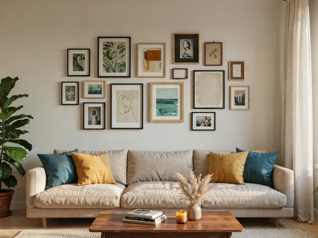
The living room is where guests spend the most time, so it deserves the best 8×10 photo wall display idea you can pull off.
I always start here first whenever I decorate a new space.
This room sets the tone for the whole house.
A well-placed photo wall instantly makes a living room feel warm, personal, and finished, instead of looking like a rental unit with bare walls.
Here’s what I’ve learned works best in this particular room.
Sofas need visual weight above them.
An empty wall over a couch always feels unbalanced, no matter how nice the furniture is.
That’s where a thoughtful 8×10 photo wall display idea comes in.
It fills the space without overwhelming it.
I’ve also noticed something interesting over the years.
Living rooms with photo displays tend to feel more “lived in” to guests, even when nothing else in the room has changed.
It’s a small design shift, but it changes how the entire space feels.
A few things I always keep in mind when planning this wall:
- Keep the display centered above the furniture, not the wall itself
- Leave about 6 to 8 inches between the top of the sofa and the bottom frame
- Mix a few landscape and portrait 8×10 frames instead of using all one orientation
- Group frames close together, no more than 2 to 3 inches apart, so the display reads as one piece
Now let’s get into the two layouts I recommend most.
Gallery Wall Above the Sofa
This is the layout I recommend most often, especially for beginners.
A gallery wall above the sofa uses multiple 8×10 frames arranged in a loose, organic pattern rather than a strict grid.
Here’s how I usually set it up.
Start with one anchor frame slightly above the center of the sofa.
Then build outward, adding frames in a staggered pattern, some higher, some lower, so the eye naturally moves across the whole display.
I like using anywhere from 5 to 9 frames total for this look.
Fewer than that feels sparse.
More than that starts to feel cluttered unless you have a very large wall.
Mixing frame finishes adds even more character.
A few black frames, a few natural wood ones, maybe one thin gold frame in the mix.
It keeps the display from looking too matched or store-bought.
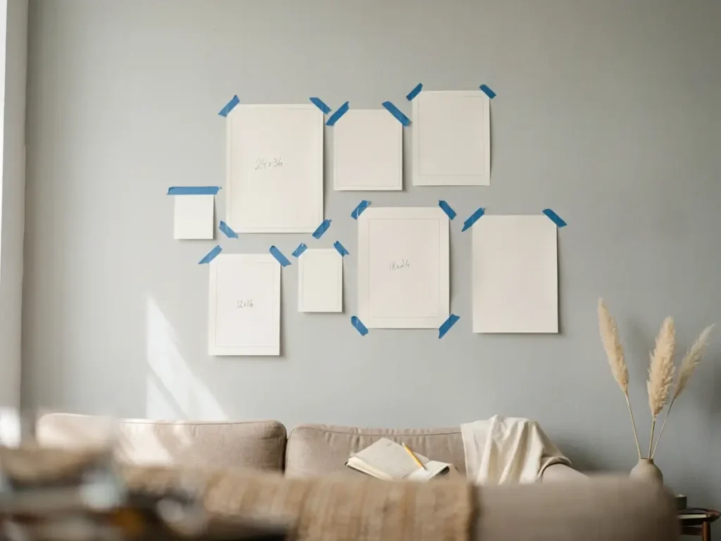
Before hammering anything, trace each frame onto craft paper and tape the paper cutouts to the wall first.
This lets you move things around freely until the spacing feels right, without a single nail hole.
Once you’re happy with the layout, hang the frames exactly where the paper templates were.
Symmetrical Grid Layout
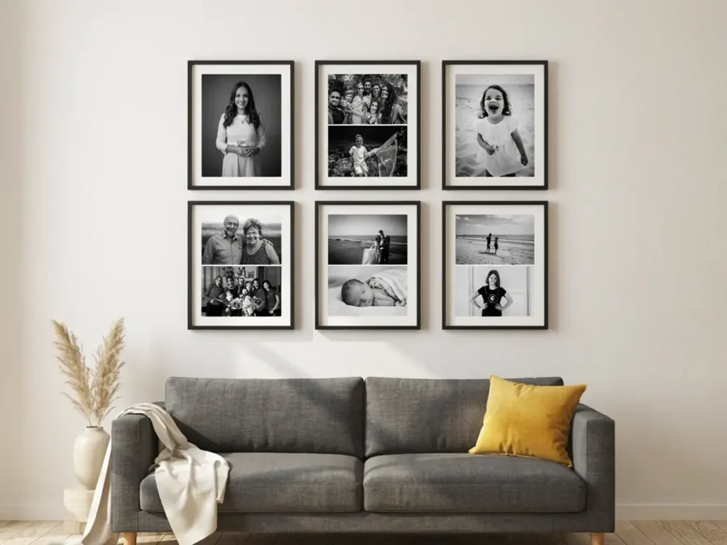
If the organic look isn’t your style, a symmetrical grid gives you the opposite effect: clean, structured, and neat.
This layout works best if you have 4, 6, or 9 frames total, since even numbers create perfect rows and columns.
Here’s the simple method I use every time.
Pick your grid size first.
A 2×2 grid using four 8×10 frames is one of my favorites for smaller sofas.
For larger walls, a 3×3 grid creates a bold, gallery-style statement.
Keep every gap identical.
I measure 2 inches between each frame, both horizontally and vertically, and I don’t deviate from that number once it’s set.
This consistency is what makes the grid feel intentional instead of accidental.
Choose frames in the exact same color and finish for this layout.
Mixing finishes works for the organic style, but it breaks the clean look a grid is supposed to have.
Stick to one finish, black, white, or natural wood, across every single frame.
Photos matter here too.
I recommend either all black-and-white photos, or all color photos, but not a mix of both within one grid.
The consistency in photo tone ties the whole display together and makes it feel curated rather than random.
Bedroom 8×10 Photo Wall Display Ideas
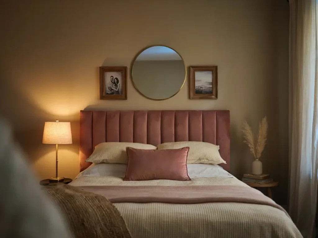
The bedroom is where an 8×10 photo wall display idea feels the most personal.
This is the one room where you’re not decorating for guests.
You’re decorating for yourself, and for the people you share that space with.
That changes the whole approach.
I always tell people the bedroom wall should feel calm, not busy.
You want something that makes you smile right before you fall asleep, not something loud or overwhelming.
Soft color tones work better here than bold, high-contrast frames.
Natural wood, cream mats, or muted black frames tend to fit bedroom lighting the best.
Photo choice matters more in this room too.
I always lean toward candid, quiet moments here.
A photo from a wedding, a trip, or just an ordinary Sunday morning fits better than a formal portrait.
Here are the two layouts I recommend most for bedrooms.
Above the Headboard Display
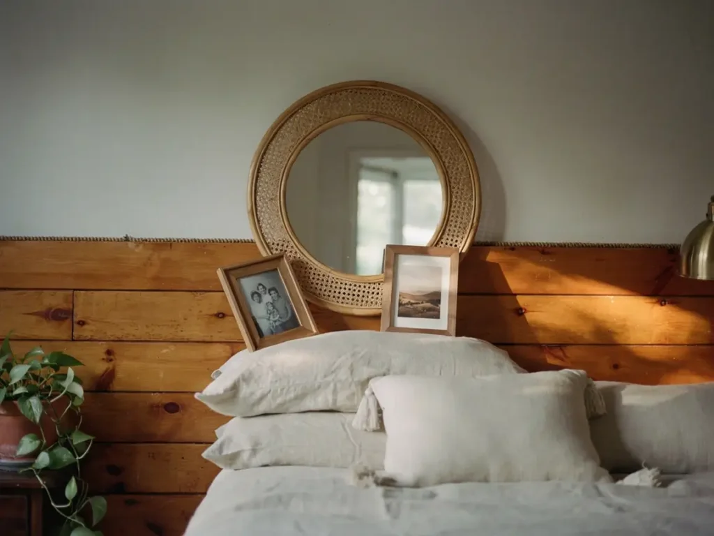
This is the classic bedroom placement, and for good reason.
It fills the empty space above the bed without requiring you to rearrange any furniture.
Start by measuring the width of your headboard.
Your photo display should stay within that width, or slightly narrower.
Going wider than the headboard makes the whole arrangement feel disconnected from the bed itself.
I usually center one larger piece, sometimes a mirror or a single bigger frame, then flank it with 8×10 frames on either side.
Two on the left, two on the right works well for most queen and king beds.
Leave at least 8 inches of space between the top of the headboard and the bottom of your display.
This keeps the layout from feeling cramped, even in smaller bedrooms.
Minimal Two-Photo Accent Wall
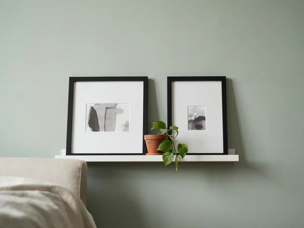
Not every bedroom wall needs a full gallery.
Sometimes two 8×10 frames, placed simply, say more than nine ever could.
I use this layout often on smaller accent walls, or on the wall opposite the bed.
Pick two photos that feel connected somehow, same trip, same year, or same person at two different ages.
Hang them at eye level when seated on the bed, roughly 60 inches from the floor to the center of the frames.
Space them 4 to 6 inches apart, no more.
Any wider and the two photos stop feeling like a pair.
This layout works especially well in rentals or smaller bedrooms, where a large gallery wall would feel like too much for the space.
Hallway and Staircase 8×10 Photo Wall Display Ideas
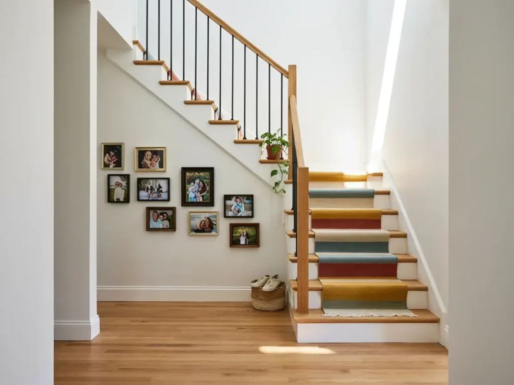
Hallways and staircases are the most overlooked spaces in most homes, yet they’re perfect for an 8×10 photo wall display idea.
You walk through them every single day.
That makes them one of the best places to actually enjoy your photos, instead of hanging them somewhere you rarely sit and look.
Long, narrow walls that usually stay empty suddenly become a real feature once you add photos here.
I’ve turned more boring hallways into favorite parts of the house with this one change than almost anything else.
Staircases bring their own challenge, since the wall itself is on an angle.
But that angle is actually an advantage once you know how to use it.
Here are the two layouts I recommend most for these spaces.
Ascending Staircase Layout
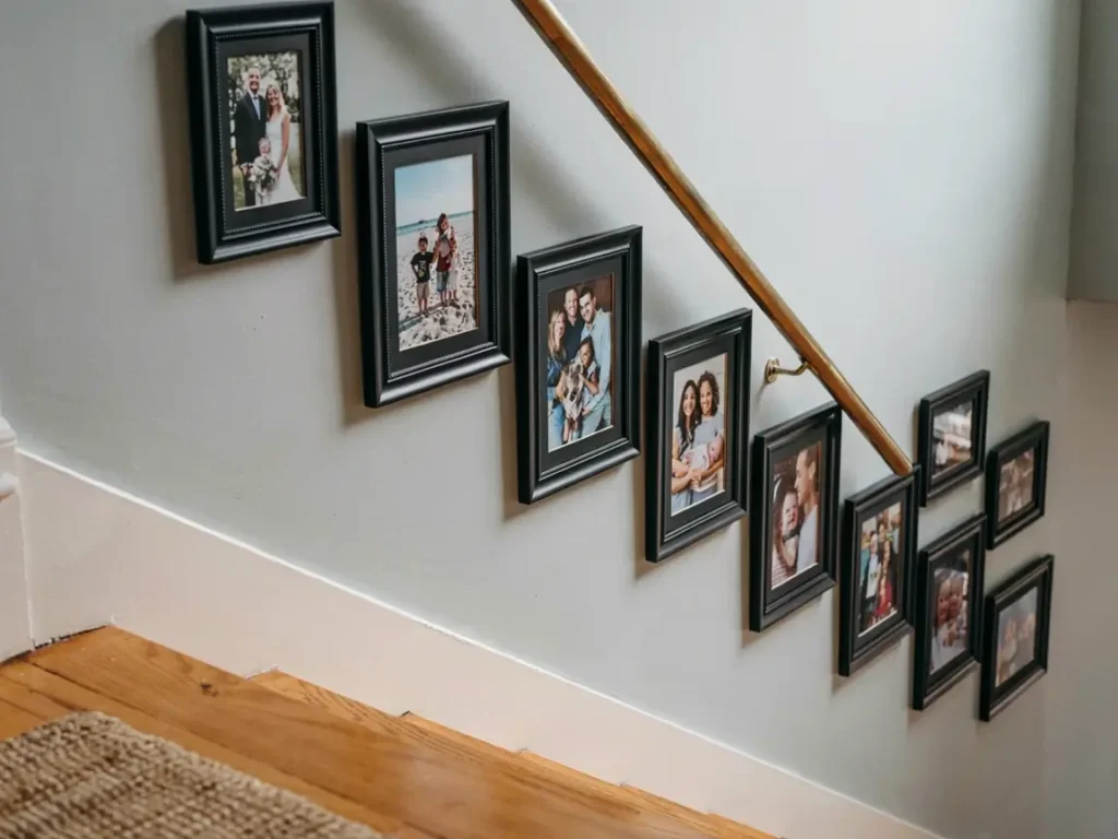
This layout follows the line of your staircase, so the frames climb the wall exactly the way the steps do.
Start at the bottom of the staircase with your first frame roughly 36 inches from the step.
As you move each frame up the stairs, keep the same vertical spacing from the step below it.
I recommend measuring this once at the bottom, then repeating that exact number all the way up.
This keeps the line looking intentional instead of scattered.
Use identical frames for this layout, same color, same size, same finish.
Since the eye is already tracking a diagonal line, mismatched frames make the whole thing feel messy rather than deliberate.
Most staircases fit anywhere from 6 to 12 frames comfortably, depending on the length of the staircase.
Narrow Hallway Row Display
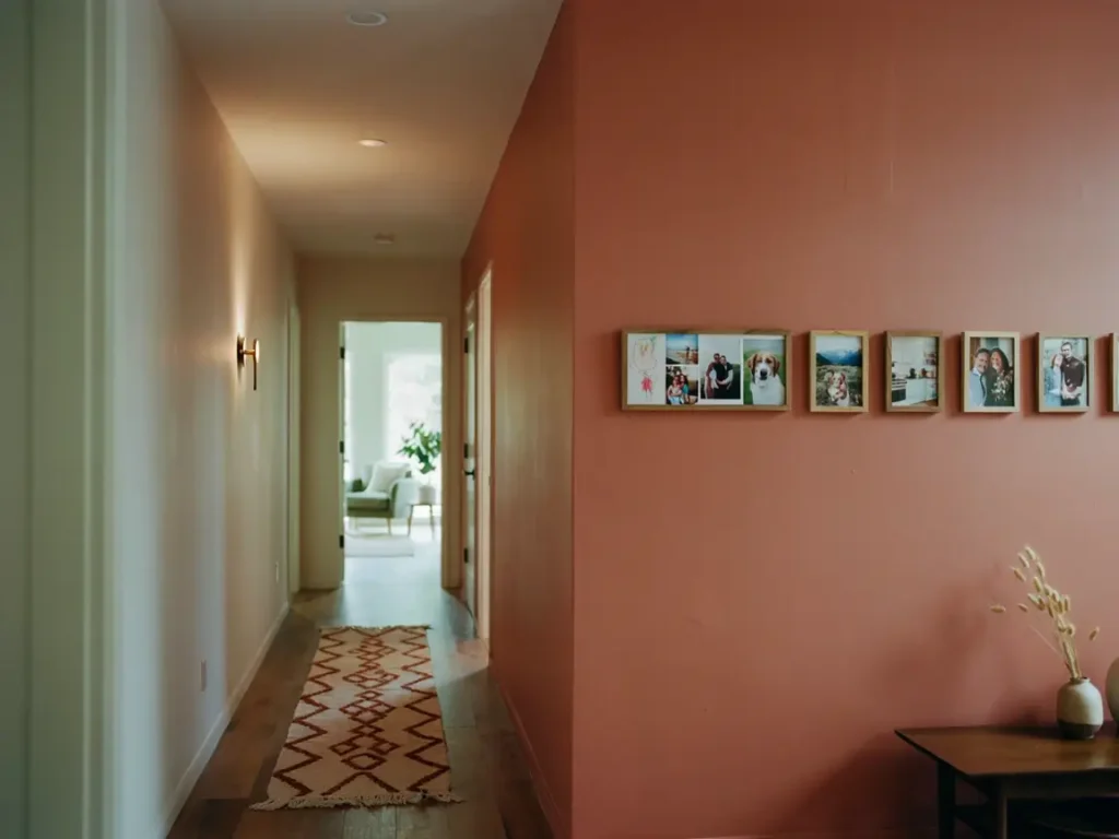
Hallways are often too narrow for a wide gallery wall, so a single horizontal row works best here.
Hang your 8×10 frames in one straight line, centered at eye level, about 57 to 60 inches from the floor to the center of each frame.
Space each frame 3 inches apart.
Consistent spacing matters more in a hallway than almost anywhere else, since there’s no furniture below to distract the eye if something looks off.
I like using this layout for a photo timeline, oldest photo on one end, most recent on the other.
Guests naturally end up “reading” the wall as they walk past it, which turns a plain hallway into a small story.
Home Office 8×10 Photo Wall Display Ideas
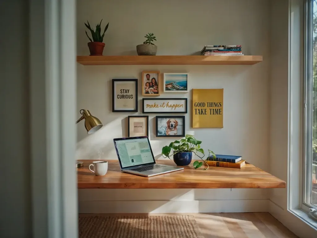
A home office needs a different kind of 8×10 photo wall display idea than the rest of the house.
This is a space for focus, not just decoration.
The photos you choose here should motivate you, or at least make the room feel less sterile during a long workday.
I’ve set up a few of these for clients who work from home, and the difference in mood is noticeable almost immediately.
A blank office wall feels clinical.
Add a few personal photos, and suddenly the room feels like yours instead of a generic workspace.
Here’s what I recommend for this room specifically.
Framed Motivation Wall
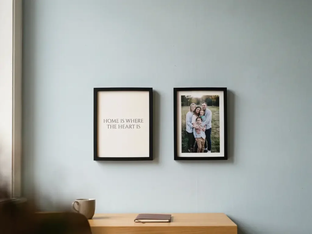
This layout mixes photos with short quotes or prints that keep you motivated through the workday.
I usually recommend 3 to 5 8×10 frames total for this style, since a home office wall is often smaller than a living room wall.
Place the display directly in your eyeline when seated at your desk, not above it.
This way, you actually see it during the day, instead of it just sitting behind you unseen.
Mix one or two photos with one or two motivational prints or quotes.
Keep the color palette consistent, muted tones work best so the display doesn’t distract you from actual work.
Mix of Photos and Art
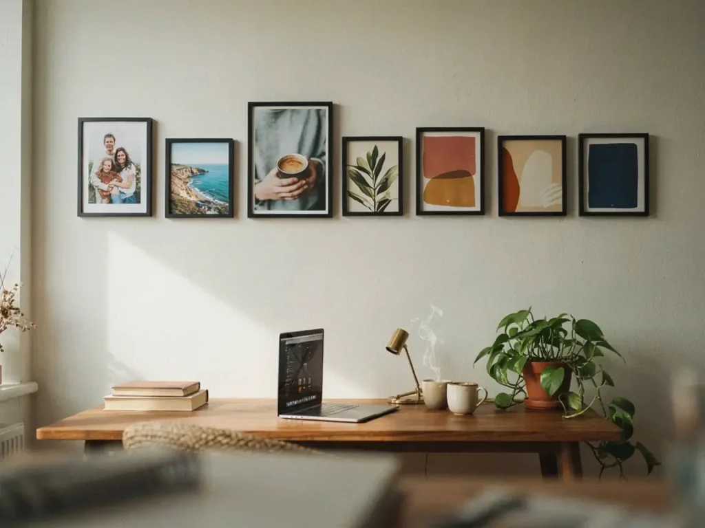
If a fully personal wall feels too casual for a home office, blending photos with art strikes a better balance.
Alternate between 8×10 photo frames and matching-sized art prints in the same layout.
I recommend a simple pattern, photo, art, photo, art, repeated across the row or grid.
If you’re short on art prints, browsing a few oil painting ideas for home decor is a great starting point, since warm, textured pieces pair beautifully with personal photos without competing for attention.
This keeps the wall feeling professional enough for video calls, while still showing a personal touch.
Stick to one frame colour throughout, this small detail makes photos and art prints look like they belong together, rather than randomly combined.
Kids Room or Nursery 8×10 Photo Wall Display Ideas
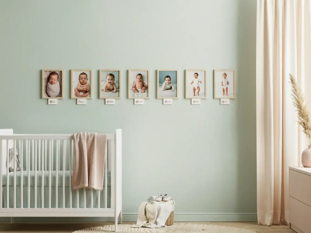
A nursery or kids room calls for a softer, simpler 8×10 photo wall display idea than anywhere else in the house.
Little ones grow fast.
This wall becomes a way to capture that, one frame at a time.
I always tell new parents not to overthink this room.
Simple, soft, and easy to update later works far better than something elaborate and permanent.
Growth Story Timeline Wall
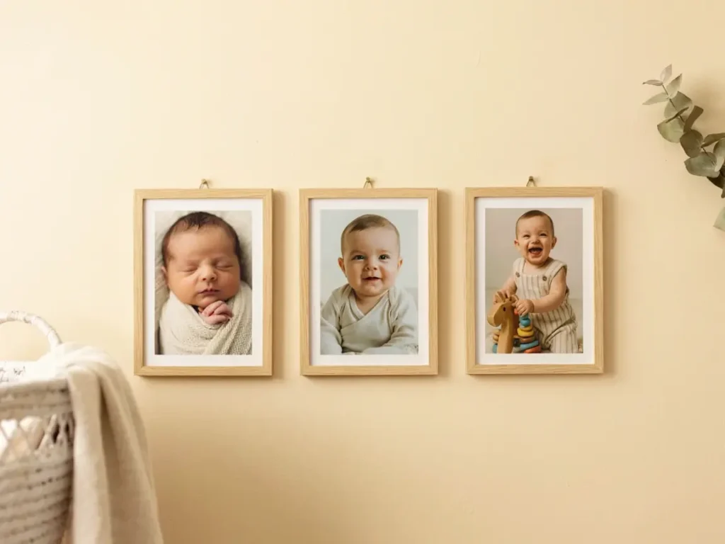
This layout captures your child’s growth using a simple, repeatable format.
Choose one 8×10 photo per month, or per milestone, whichever feels more natural for your family.
Hang them in one straight horizontal line, left to right, in the order they happened.
Keep spacing even, about 3 inches between each frame, so the timeline reads clearly at a glance.
Use the same frame style throughout, plain white or light wood works beautifully in nurseries.
This keeps the focus on the photos themselves, not the frames around them.
One thing I always recommend to parents.
Leave a little extra wall space at the end of the row.
That way, you can keep adding photos as your child grows, without needing to redo the entire display later.
Tips for Hanging 8×10 Photos Without Damaging Walls
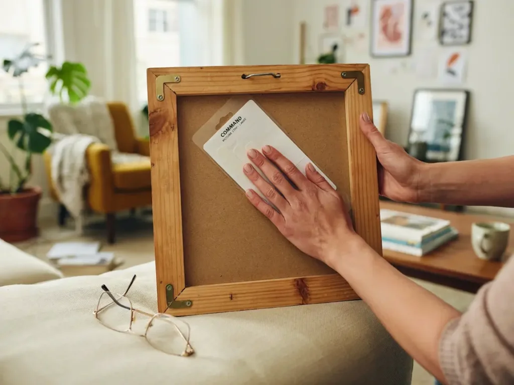
No 8×10 photo wall display idea is worth ruining your walls over, so let’s talk about doing this the right way.
Renters especially worry about this part.
I get asked about wall damage more than almost anything else when I’m helping someone plan a display.
The good news is you have options now that didn’t exist a few years back.
Command Strips and Adhesive Hooks
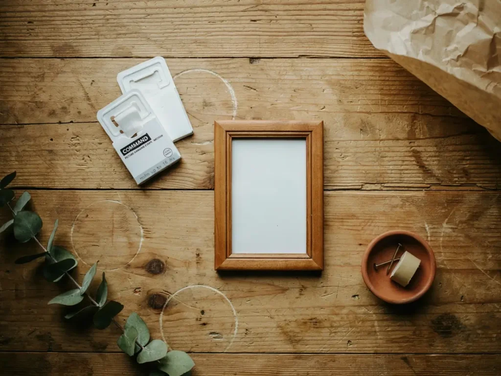
Command strips have genuinely changed how I hang photo displays, especially in rental homes.
They hold most standard 8×10 frames without any issue, as long as you check the weight limit printed on the packaging first.
Heavier frames, glass-front or wood, sometimes need two strips instead of one.
According to 3M, Command Picture Hanging Strips can hold frames up to 24 inches by 36 inches and weighing as much as 20 pounds, which covers almost every standard 8×10 frame with room to spare.
You can check the full weight limit guide here before buying, just to match the right strip to your frame. Amazon
Press each strip firmly for about 30 seconds, then wait a full hour before hanging the frame.
That waiting period matters more than people think.
The adhesive needs time to fully bond, and skipping this step is the main reason strips fail.
When it’s time to take a frame down, pull the tab slowly and straight down, not outward.
This removes the strip cleanly, without pulling paint or drywall off with it.
Using a Paper Template First
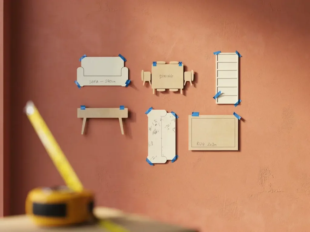
I mentioned this earlier for the gallery wall, but it’s worth repeating here because it applies to every layout in this article.
Trace each frame onto craft paper, cut it out, and tape the paper version to the wall exactly where you’re planning to hang the real thing.
Step back and look at it from across the room.
Live with it for a day or two if you can.
Layouts often look different once you’re seeing them at full scale, compared to how they looked in your head.
Only once every paper cutout feels right do you make a single mark or hole.
This one habit alone prevents almost every mistake people make with 8×10 photo wall display idea projects, more nail holes than intended, crooked spacing, or a layout that just doesn’t sit right once it’s up.
Conclusion
Every wall in your home has the potential to tell a story, and now you know exactly how to make that happen with the right 8×10 photo wall display idea.
From the living room to the nursery, each space calls for its own approach, its own spacing, and its own personality.
The good news is none of this requires a professional designer or a big budget.
A few frames, a little planning with paper templates, and some patience is really all it takes.
Start with just one wall.
Pick the room that bothers you the most right now, the one you walk past every day and wish looked different.
Once you see how much a simple photo display changes that space, you’ll want to do it in every room.
Which layout are you trying first?
About Grace Hyden