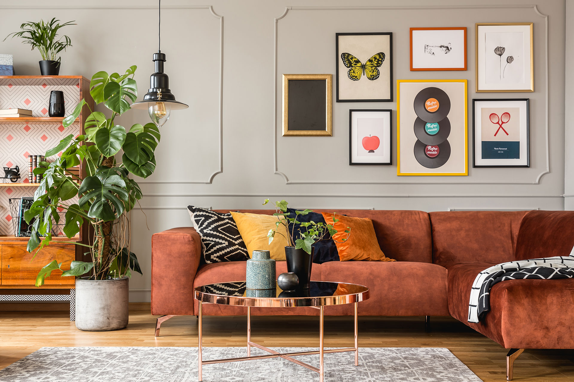
80’s home decor ideas are having a real moment again, and honestly, I’m not surprised.
I remember scrolling through old photos of my aunt’s living room a few years back and thinking, wait, this actually looks good now.
That bold color, that fearless mix of patterns, it all felt fresh instead of dated.
If you’ve been stuck staring at yet another all-white, minimalist room and feeling bored out of your mind, you’re not alone.
A lot of homeowners tell me the same thing.
Their space feels safe, but it doesn’t feel like them.
That’s exactly where these 80’s home decor ideas come in.
They bring back personality, color, and a sense of fun that a lot of modern design strips away.
I’ve pulled together 15 ideas that still hold up beautifully today, nothing costume-y or over the top, just smart ways to bring that retro spirit into a home that still feels current.
Whether you want a full room transformation or just a few small touches, there’s something here you can start with this weekend.
Bold Geometric Patterns Make a Comeback
Geometric patterns were everywhere in the 80’s, and I still think they’re one of the easiest 80’s home decor ideas to bring back without going overboard.
Think sharp triangles, bold zigzags, and repeating shapes in punchy colors.
I tried this in my own hallway last year with a single geometric rug, and it completely changed how the space felt.
It didn’t look retro in a costume way.
It looked intentional.
What I’ve noticed after styling a few rooms this way is that geometric patterns work best when they’re paired with something calmer nearby, like a plain sofa or a solid-colored wall.
That balance keeps the room from feeling too busy, especially in smaller homes across the US and UK where space is already tight.
Where to Use Geometric Prints First
You don’t need to redo an entire room to get this look.
Start small and see how it feels.
- A geometric-print rug in the living room or entryway
- Throw pillows with angular patterns on a neutral couch
- A single accent wall with a bold geometric print
If you already lean toward a mixed, eclectic style, this pattern pairs really well with the kind of layered, pattern-on-pattern look I covered in my bohemian 90’s home decor guide.
Colors That Make the Pattern Pop
Color choice matters just as much as the pattern itself.
The 80’s leaned hard into contrast, and that’s exactly why these patterns still catch the eye today.
Black and white geometric prints feel modern and clean.
Add a pop of red, mustard, or teal, and suddenly the whole piece feels like a proper 80’s home decor idea instead of something generic.
I always tell homeowners to pick one dominant color from their existing room and let the geometric piece echo it back, rather than introducing something completely new.
It keeps the whole space feeling pulled together instead of random.
Bring Back the Iconic Mauve and Teal Color Combo
If there’s one color pairing that instantly says 80’s home decor ideas, it’s mauve and teal.
I know it sounds like an odd combo on paper, but the two tones balance each other out in a way that feels warm and cool at the same time.
I first saw this pairing done well in a client’s bedroom a couple of years ago, and it completely changed my mind about mauve.
It’s not dusty or old-fashioned when it’s used right.
It actually feels quite soft and current.
What makes this color combo work so well for modern homes is that mauve reads as a muted pink, so it never feels too loud, while teal adds just enough depth to keep the room from feeling flat.
Best Rooms for This Color Pairing
This combo tends to shine most in spaces where you want a calm, cozy feel rather than something bold and busy.
- Bedrooms, through bedding, curtains, or an accent wall
- Living rooms, using a mauve sofa with teal cushions or a throw
- Powder rooms, where a small pop of color makes a big impact without overwhelming the space
Bathrooms and small guest rooms are especially good candidates, since a little color goes a long way in a tight space.
How to Balance the Two Tones
The key here is ratio, not repetition.
I usually tell homeowners to treat one color as the base and the other as the accent, rather than splitting the room evenly.
So if your walls are mauve, keep the teal to smaller touches like pillows, a vase, or a piece of art.
Flip it if your walls are teal instead.
This kind of balance is exactly why these 80’s home decor ideas still work in 2026, even in homes that lean more neutral overall.
It gives you that retro color story without turning the whole room into a period piece.
Brass Accents That Add Instant Retro Charm
Brass is one of those materials that never really left, but it definitely peaked in the 80’s.
Warm, slightly worn brass gives a room that lived-in, collected-over-time feel that a lot of homeowners are chasing right now.
I added a small brass lamp to my own bookshelf last winter, almost as an experiment, and it ended up being the piece everyone noticed first.
That’s the thing about brass.
A little goes a long way.
Design research has consistently shown that warm metals like brass photograph better in natural light than cooler tones like chrome or silver, which is probably why brass keeps showing up again and again in these 80’s home decor ideas.
Brass Lighting Fixtures
Lighting is usually the easiest place to start.
- A brass floor lamp in the living room
- Brass pendant lights over a kitchen island or dining table
- Small brass table lamps on nightstands or side tables
Even swapping just one fixture can shift the whole feel of a room without a full renovation.
Brass Hardware and Small Details
If a full lighting swap feels like too much right now, hardware is a smaller but still effective step.
Cabinet handles, drawer pulls, and even curtain rods in brass add that same warm touch.
I usually recommend starting in the kitchen or bathroom, since hardware changes there are quick and don’t require much cost.
For anyone already drawn to warmer, textured materials, this pairs naturally with the rattan and wicker furniture trend from the same era, since both lean into that collected, layered look rather than anything too polished.
Statement Wallpaper With a Fun 80’s Twist
Wallpaper went through a rough phase where everyone avoided it, but it’s back, and honestly, it never should have left.
The 80’s version wasn’t shy either.
Bold prints, oversized shapes, sometimes even a bit of shine.
I put up a small section of patterned wallpaper in my own dining nook last spring, just one wall, and it completely changed how the whole room felt without touching anything else.
That’s really the appeal of these 80’s home decor ideas.
You get a big visual impact from a fairly small, contained change.
What surprised me while researching older interior magazines from that era is how often wallpaper was used in just one section of a room rather than covering everything.
A stairwell, the back of a bookshelf, even just the lower half of a wall.
That restraint is actually what makes the pattern feel special today instead of overwhelming, and it’s a big reason this trend photographs so well for Pinterest in particular.
Bold Prints vs Subtle Retro Patterns
Not every home wants the same intensity, and that’s completely fine.
If you love color and pattern, go for it fully.
Large florals, abstract shapes, or geometric prints in saturated tones work beautifully in a room you don’t spend all day in, like a powder room or a home office.
If you’d rather ease into the look, subtler options exist too.
Think smaller-scale prints in muted tones, or a textured wallpaper that hints at a pattern without shouting it.
Either direction still counts as a genuine nod to 80’s home decor ideas, it just depends on how bold you want to feel.
Best Wall to Feature It On
Picking the right wall matters more than people expect.
An accent wall behind a bed or a sofa tends to work well, since the furniture naturally breaks up the pattern and keeps the room balanced.
Stairwells are another great option, especially in homes across the UK where staircases often run right through the main living area and act almost like a gallery space on their own.
I generally steer people away from wallpapering an entire small room in a heavy pattern, since it can make the space feel closer and busier than intended.
One feature wall almost always does the job better than four matching ones.
Rattan and Wicker Furniture for a Cozy Retro Feel
Rattan and wicker furniture carry that warm, sun-soaked feeling that made them such a staple piece across 80’s living rooms and porches.
There’s a reason this material keeps resurfacing every few years instead of fading out completely.
It photographs beautifully, it pairs with almost any color palette, and it adds texture to a room without adding visual clutter.
I picked up a small rattan side table at a flea market a while back, mostly on a whim, and it’s still one of my favorite pieces in my own home.
It just fits everywhere.
Interior researchers often point out that natural, textured materials like rattan create a sense of warmth that flat, painted surfaces simply can’t match, which explains why these 80’s home decor ideas keep pulling people back in, season after season.
Rattan Chairs and Seating
A single rattan chair can act as a soft focal point in a room full of straight lines and plain fabric.
Peacock-style rattan chairs, in particular, carry that unmistakable 80’s silhouette, tall, fan-shaped, almost sculptural on their own.
Placed near a window or in a reading corner, they bring texture and personality without competing with the rest of the furniture.
Wicker Storage and Accent Pieces
Beyond seating, wicker works well in smaller, functional pieces too.
Baskets for blankets, a wicker mirror frame, or a small wicker shelf all add that same textured warmth in a much subtler way.
These smaller pieces are usually the easiest entry point if a full rattan chair feels like too big a commitment right now, and they still deliver that same retro charm the era is known for.
Neon Accents Done the Tasteful Way
Neon has a bit of a reputation problem.
Most people picture something loud, harsh, maybe even a little cheap looking, and I get why.
But used with a light hand, neon is actually one of the most fun 80’s home decor ideas you can experiment with, especially once you start treating it as an accent instead of a full theme.
I added a single neon-style sign to my home office last year, nothing wild, just a soft pink outline shape sitting above my desk.
It became this odd little mood booster.
I’d walk in tired, glance at it, and somehow feel a bit more awake.
That’s not just me imagining things either.
Research across neuroscience and environmental psychology shows that saturated, vivid colors genuinely influence mood and energy levels, not just how a room looks on the surface.
That’s likely why one small neon piece can shift the entire feel of a space, even when everything else in the room stays completely neutral.
If you want to go deeper into how color affects the way a room feels day to day, Sherwin-Williams has a solid breakdown of color psychology worth a quick read before you commit to anything bold.
Small Neon Touches That Work
A neon accent doesn’t need to take over a room to make an impact.
A single wall sign, a neon-edged mirror, or a lamp with a soft glowing tube brings in that unmistakable 80’s energy without turning the space into a nightclub.
Home offices, teenage bedrooms, and game rooms tend to be the easiest starting points, mainly because these spaces already allow a bit more personality than a formal living room would.
I usually suggest starting with something you can unplug or remove easily, like a sign or a lamp, before committing to anything more permanent like neon trim or lighting built into a shelf.
Where Neon Feels Overdone
The mistake I see most often is treating neon as the main event instead of the accent.
Multiple neon pieces crammed into one small room quickly start to feel more like a themed bar than an actual home.
And since highly saturated colors can feel exciting at first but tend to become tiring over longer periods of exposure, that’s exactly why one thoughtful piece almost always outperforms a room full of them.
I usually tell homeowners to pick just one neon piece per room and let everything else stay fairly calm around it.
That contrast is what makes the neon feel intentional instead of overwhelming, and it’s the real difference between a room that feels styled and one that feels like a costume set.
Gallery Walls With Vintage Frames
Quick question before we get into this one.
When’s the last time you actually stopped and looked at something on your wall, instead of just walking past it?
If you’re drawing a blank, you’re definitely not alone.
That’s exactly the gap a good gallery wall fills, and it’s one of my favorite 80’s home decor ideas because it turns a boring hallway or a plain wall into something people actually pause for.
I put together my first real gallery wall almost by accident.
I had a stack of secondhand frames sitting in a closet for months, different shapes, different finishes, some slightly chipped.
One weekend I just started arranging them on the floor, moved things around for an hour, then hung them up.
It looked messier than I expected at first, then somehow it just clicked.
What I’ve learned since is that vintage frames work so well together precisely because they don’t match.
That imperfection is the whole point.
A study on visual clutter and design actually found that a certain amount of imperfection and variation makes a space feel more personal and less staged, which is probably why gallery walls built from mismatched frames tend to feel warmer than a single big framed print ever does.
So, are you someone who already has a drawer full of old frames sitting around unused?
Because if so, you’re closer to this look than you think.
Mixing Frame Styles and Sizes
Here’s where a lot of people overthink it.
You don’t need matching frames, matching colors, or even matching shapes.
- Mix gold, wood, and painted frames together for texture
- Combine at least two or three different sizes so the wall doesn’t look too uniform
- Leave a little breathing room between frames instead of packing them edge to edge
Honestly, the “wrong” frame is usually the one that ends up making the whole wall interesting.
What Photos or Art to Feature
This is the part where people get stuck the longest.
Should it be family photos?
Art prints?
A mix of both?
My honest answer, after doing this more times than I can count, is that a mix works best.
Try pairing a couple of personal photos with one or two art prints or even a small mirror thrown into the layout.
It keeps the eye moving instead of settling on just one type of image, and it turns the whole wall into something worth that second glance we talked about earlier.
Chunky Wood Furniture With Curved Edges
Most homes I walk into these days are full of straight lines.
Square coffee tables, sharp-edged shelves, chairs with perfectly flat backs.
It works, but after a while, everything starts to blend together.
That’s exactly why chunky, curved wood furniture stands out so much whenever it shows up in a room.
This is one of those 80’s home decor ideas that does its job quietly, no bright colors or bold patterns needed.
Just weight, warmth, and a shape that feels a little softer than what most modern furniture offers.
I picked up a curved wooden side table at an estate sale a couple of years back.
Heavier than it looked, definitely not something built for flat-pack shipping.
It’s held up better than half the furniture I’ve bought since, and it still gets more comments than pieces that cost three times as much.
Furniture historians often point out that the shift toward rounded, organic shapes in the 80’s was partly a pushback against the sharp, minimal styling of the decade before it.
That same softness is probably why these 80’s home decor ideas still feel so easy to live with today.
Curves read as warmer.
Less clinical, more lived-in.
Best Pieces to Start With
A rounded coffee table works well as a room’s main anchor piece, especially if everything else around it is fairly plain.
A single curved-back accent chair near a window can do the same job on a smaller scale, and it’s usually the easiest first step if you’re not ready to commit to a bigger piece.
Chunky wood console tables are another solid option for an entryway, somewhere that gets noticed the moment someone walks in.
Pick whichever piece your room is actually missing right now, rather than trying to add all three at once.
Pairing Wood Tones With Modern Decor
The “dated” feeling people worry about usually isn’t about the wood itself.
It’s about what’s sitting next to it.
Warm, chunky wood pieces blend into modern rooms surprisingly well, as long as they’re not paired with equally heavy, old-fashioned accessories around them.
Keep the walls simple.
Keep the lighting current.
Let the wood piece carry the era on its own instead of matching it with more vintage details.
That contrast is really the reason these 80’s home decor ideas work so naturally inside homes that otherwise look completely modern.
One bold, warm statement piece says more than an entire room stuck in the past ever could.
Memphis Design Inspired Accessories
Memphis design might be the boldest thing to come out of the 80’s, and yet most people can’t name it even when they’ve seen it a hundred times.
Squiggly lines, clashing colors, shapes that don’t seem to follow any logic at all.
It sounds chaotic on paper, and honestly, in full doses, it kind of is.
But in small accessory-sized amounts, Memphis style becomes one of the most playful 80’s home decor ideas you can bring into an otherwise calm room.
I bought a small Memphis-pattern vase at a vintage shop years ago, mostly because it made me laugh a little.
Squiggles, random dots, colors that had no business working together.
It sits on my bookshelf now, surrounded by plain, neutral objects, and it’s usually the first thing people ask about when they visit.
Design writers often describe Memphis style as decor that refuses to take itself seriously, which is exactly why it works so well as a single accent rather than a full room commitment.
Too much of it starts to feel busy fast.
Just a little makes a room feel like it has a sense of humor.
Small Memphis Accent Pieces
A patterned vase, a squiggly mirror frame, or a small side table with an odd geometric leg can all bring this style in without overwhelming a space.
Even a single throw pillow with a bold Memphis print does the job, especially against a plain sofa or neutral bedding.
Bookshelves are a great spot for this too, since one loud little object surrounded by calmer items tends to stand out more than it would in a busier room.
How Much Memphis Style Is Too Much
This is where a lot of people go wrong.
One or two Memphis-inspired pieces per room feels intentional and fun.
Four or five in the same space starts to feel more like a costume party than a home.
I usually tell homeowners to treat Memphis pieces the way you’d treat a strong spice in cooking.
A small amount changes everything.
Too much, and it overwhelms everything else on the plate.
Faux Fur and Textured Throws
Picture this.
It’s a random Tuesday evening, nothing special planned, and you just want to sink into your couch and disappear for a bit.
Now picture that same couch with a thick faux fur throw draped over one side.
Feels different already, right?
That’s the whole magic of texture, and it’s honestly one of the most underrated 80’s home decor ideas out there.
Nobody talks about it the way they talk about bold colors or statement furniture, but it might have the biggest effect on how a room actually feels to be in.
I bought my first faux fur throw almost as an impulse purchase, tossed it over an armchair without much thought.
Within a week, that chair became the one spot everyone fought over.
Not because the chair changed.
Because the way it felt to sit in it changed completely.
Interior design research consistently links tactile, soft materials in a room to a stronger sense of comfort and relaxation compared to smooth or hard surfaces, which lines up with exactly what I noticed happening in my own living room.
Texture does something color alone just can’t.
It invites touch.
And a room people want to touch is usually a room people want to stay in longer.
So here’s a fun little test for you.
Walk around your own living room right now, mentally, and count how many soft, textured surfaces you actually have.
Chances are, it’s fewer than you’d think.
Best Rooms for Cozy Textures
Living rooms and bedrooms benefit the most from this, mainly because they’re the spaces where people actually want to slow down.
A faux fur throw over a reading chair works well.
So does one folded at the foot of a bed, or draped loosely over a bench near a window.
Even a small faux fur rug in front of a fireplace or under a coffee table adds that same cozy, retro layer without taking over the whole room.
Colors That Feel Retro, Not Dated
Here’s the part people get wrong most often.
Bright white faux fur can feel more modern-minimalist than retro, which isn’t necessarily wrong, just not the vibe if you’re chasing that authentic 80’s home decor idea specifically.
Warmer tones tend to nail the era better.
Think caramel, rust, deep plum, or a soft camel shade.
These colors carry that same warmth the whole decade was known for, and they blend into a modern room far more easily than people expect.
One throw, one color, one texture shift.
That’s really all it takes to notice the difference the next time you sit down.
Bold Floral Prints on Soft Furnishings
Florals never really went anywhere, but the 80’s version was a completely different animal compared to what most people picture when they hear the word floral today.
Forget the small, delicate, almost invisible prints you see on modern bedding.
We’re talking oversized blooms, saturated colors, patterns that practically shout from across the room, and somehow it worked, and honestly it still does if you know where to put it.
My mother had a floral armchair growing up that I genuinely hated as a kid, thought it was the ugliest thing in the house, and now I catch myself looking up almost identical fabric online because apparently taste comes full circle whether you want it to or not.
Funny how that happens.
A soft furnishing covered in big, bold flowers brings a kind of warmth into a room that plain fabric just can’t replicate, and it’s become one of those 80’s home decor ideas people underestimate until they actually try it.
Cushions are the obvious entry point.
Curtains too, though I’d say those are a bigger commitment since you’re stuck looking at that pattern every single day whether you’re in the mood for it or not.
Bedding works surprisingly well as well, especially in a guest room where you’re not living with the pattern daily and can enjoy it more like a little escape when you walk in.
Interior textile researchers have pointed out that large-scale prints tend to read as more grounded and less busy than small repeated patterns once you’re standing a few feet back from them, which kind of explains why a giant floral duvet doesn’t feel as chaotic up close as it looks in a photo.
Distance changes everything with these prints.
Cushions, Curtains, and Bedding Ideas
Start with cushions if you’re not sure yet.
Two or three on a plain sofa, nothing else needs to match.
Curtains work best in a room where you’re ready to commit to the pattern being the star, living rooms usually, sometimes a bedroom if the walls stay simple.
Bedding, particularly in a spare room or a teenager’s space, tends to forgive a bolder choice than you’d make for your own bedroom, since you’re not staring at it every night yourself.
Mixing Florals With Other Patterns
Here’s where people usually freeze up, worried they’ll clash something badly.
Truth is, florals actually pair better with a second pattern than they do sitting completely alone, stripes especially, since the straight lines give the eye somewhere calm to rest between the busy floral sections.
Small geometric prints work too, in smaller doses though, maybe just a single cushion in the mix rather than covering half the room in it.
The mistake isn’t mixing patterns.
It’s mixing too many at once without any plain fabric anywhere in the room to let everything breathe.
Mirrored Furniture for a Glam Retro Look
Mirrored furniture always feels like it’s trying to disappear and show off at the same time, which sounds contradictory until you actually see it in a room.
A mirrored dresser catches every bit of light around it, bounces it back, and somehow makes even a small bedroom feel like it has an extra window.
I picked up a mirrored side table secondhand a while back, chipped in one corner, honestly probably should’ve passed on it, but it sits next to my bed now and it’s the first thing that catches my eye most mornings.
There’s something about that reflective surface that just feels a little glamorous without trying too hard.
This is one of those 80’s home decor ideas that reads as more elegant than loud, which makes it an easy sell even for people who think they don’t like retro style at all.
It doesn’t scream the decade the way neon or Memphis prints do.
It just quietly adds shine.
Small bedrooms and dark hallways benefit the most, since the mirrored surface reflects whatever light is already in the room instead of needing more of it.
If you’re already leaning into wall-mounted mirrors or a gallery-style arrangement near your entryway, this pairs naturally with the layered look I walked through in my 8×10 photo wall display guide, since both lean on reflection and arrangement to make a small space feel bigger than it is.
Best Furniture Pieces to Try First
A mirrored dresser or nightstand is usually the easiest starting point, mainly because bedrooms already lend themselves to that soft, glamorous feel.
A mirrored console table works well in an entryway too, especially paired with a simple lamp on top.
Coffee tables with mirrored tops can work, though I’d only recommend that in a room without small kids running around, for obvious reasons.
Placement Tips for Small Spaces
The trick with mirrored furniture is not overdoing it in one room.
One piece, maybe two at most, is usually enough to get that light-bouncing effect without the room starting to feel like a showroom.
Place it across from a window if you can, so it actually has natural light to reflect during the day instead of just sitting there looking pretty at night.
Vintage Lamps With Sculptural Bases
Lighting gets ignored more than almost anything else in a room, which is strange considering how much it actually shapes the mood of a space once the sun goes down.
The 80’s had a real thing for lamps that looked more like small art pieces than functional objects, curved ceramic bases, oddly shaped stems, sometimes even lamps that looked like they belonged in a museum more than on a nightstand.
I found one at a garage sale years ago, a chunky ceramic base in a swirled cream and rust pattern, cost me almost nothing, and it still gets more attention than lamps I’ve bought brand new for triple the price.
Something about a sculptural base just feels intentional in a way flat, plain lamp stands never quite manage.
This is one of those 80’s home decor ideas that works even in rooms that otherwise look completely modern, mainly because a lamp is small enough to feel like an accessory rather than a full commitment.
Nobody’s redecorating a whole room around one lamp.
They’re just adding one interesting object to a side table.
Design historians have noted that decorative lighting in that era often borrowed shapes from pottery and sculpture rather than strict function, which is exactly why these pieces still read as art first and lighting second, even decades later.
If you already love the kind of layered, gallery-style display I talked about in my oil painting decor guide, a sculptural lamp next to a framed piece creates almost the same effect, just at a smaller, tabletop scale.
Where to Find Authentic Vintage Lamps
Estate sales and flea markets tend to have the best luck for this, mostly because these lamps rarely get sold through mainstream furniture stores anymore.
Thrift shops occasionally have one hiding on a back shelf too, usually underpriced simply because nobody’s looking for it specifically.
Online marketplaces work as a backup if local searching doesn’t turn up anything, though prices tend to run higher once a seller recognizes what they actually have.
Styling Lamps as Statement Pieces
A sculptural lamp works best when it’s not competing with too much else nearby.
Keep the surface around it fairly simple, maybe one small object at most, so the lamp itself stays the visual focus.
Pairing it with a plain lampshade, rather than anything patterned, usually helps the base stay the star of the show instead of getting lost under a busy shade.
Pastel Kitchen Accents That Feel Fresh Again
Kitchens went through a strange phase of looking almost clinical, all white counters, stainless everything, nothing that actually felt like it belonged to a person.
The 80’s took a completely different approach, leaning into soft pastels that made even a small kitchen feel a little more personal.
Mint green, powder pink, buttery yellow, these shades all had their moment, and honestly, they’re creeping back into kitchens again for good reason.
I swapped out my kitchen canisters for a set of pale mint ones a couple of years ago, small change, took maybe ten minutes, and it somehow made the whole room feel warmer without me touching a single wall.
That’s the appeal of these 80’s home decor ideas in a kitchen specifically.
You don’t need a renovation to feel the difference.
A toaster, a mixer, a set of canisters, any one of these in a soft pastel shade can shift the whole mood of the room.
Color researchers often point out that pastel tones tend to feel less demanding on the eye compared to bright, saturated colors, which probably explains why a kitchen full of mint or blush accents feels calm rather than overwhelming, even with several pieces mixed together.
It’s color without the noise.
Small appliances are usually the easiest place to start, mainly because they’re not a permanent commitment the way painted cabinets would be.
A pastel stand mixer on the counter, a set of matching canisters, even dish towels in a soft shade, these add up faster than people expect.
Small Appliances and Accessories
A pastel kettle or toaster instantly becomes a small focal point on an otherwise plain counter.
Canister sets in matching or complementary pastel shades work well too, especially if your cabinets are already a neutral tone like white or light wood.
Even something as simple as pastel oven mitts or a dish rack adds a hint of color without requiring any real commitment.
Pastel Combinations That Work Today
Mint and blush together feel fresh rather than dated, mainly because both are soft enough not to compete with each other.
Butter yellow pairs surprisingly well with warm wood tones, which most kitchens already have in cabinets or flooring.
I’d avoid mixing more than two pastel shades in one kitchen though, since three or more together can start to feel more like a candy shop than a home.
One or two soft colors, layered through a few small pieces, usually does the trick better than trying to color-coordinate the entire room.
Statement Area Rugs With Retro Patterns
A rug is one of those things people underestimate until they actually swap one out and realize how much it was holding the whole room back.
The 80’s had a real love affair with bold, patterned rugs, geometric borders, abstract shapes, color combinations that shouldn’t have worked but somehow did.
I replaced a plain beige rug in my living room with a patterned one a while back, nothing crazy expensive, just something with a strong geometric border in rust and cream.
The room looked finished in a way it never had before, even though literally nothing else changed.
That’s honestly the power of a good rug.
It ties a room together faster than almost any other single piece, and it’s one of those 80’s home decor ideas that works even in spaces that lean fairly modern otherwise.
Flooring specialists often point out that a patterned rug can visually anchor a room the same way a piece of art does on a wall, giving the eye a clear focal point instead of letting it wander aimlessly across plain flooring.
That’s a big part of why this trend keeps resurfacing every few years, it solves a real problem, not just a decorative one.
If you’re aiming for a room that feels a bit more elevated overall, this pairs naturally with the kind of layered, considered styling I covered in my luxury living room interior design guide, since a strong rug is often the missing piece that pulls a higher-end look together.
Best Rooms for a Bold Rug
Living rooms are the obvious choice, mainly because they’re usually the largest open floor space in a home and can handle a strong pattern without feeling cramped.
Dining rooms work surprisingly well too, especially under a round table where the rug’s shape can echo the table above it.
Even a hallway benefits from this, a long runner with a bold retro pattern turns a purely functional space into something that actually feels styled.
Pairing Rugs With Neutral Furniture
The trick with a bold rug is letting it do the loud work while everything else stays quiet.
A neutral sofa, plain walls, simple curtains, these all give the rug room to be the star instead of competing with it.
I usually tell homeowners to pick their rug first if they’re starting a room from scratch, then build the furniture and color choices around it, rather than the other way around.
It’s a lot easier to match a room to a rug than to find a rug that matches everything else you’ve already committed to.
Conclusion
Fifteen ideas is a lot to take in at once, and honestly, you don’t need to touch all of them this weekend.
Pick the one that caught your eye the most while reading, maybe it was the mauve and teal combo, maybe it was that curved wood side table, and just start there.
That’s really how most good rooms come together anyway, one piece at a time, not an entire overhaul in a single afternoon.
What I love about these 80’s home decor ideas is that they don’t ask you to commit to a full theme.
A brass lamp here, a patterned rug there, one bold cushion on an otherwise plain sofa.
Small choices, layered slowly, end up feeling a lot more personal than a room that was decorated all in one go.
So take a look around your own space right now.
Is there one corner that’s been feeling a little flat lately?
Start there.
If you enjoyed this dive into retro style, you’ll probably love exploring more of the eras and looks I cover on the blog, there’s always another room waiting to be reimagined.
Save this pin for later, and come back anytime you need a little retro inspiration for your next project.
About Grace Hyden