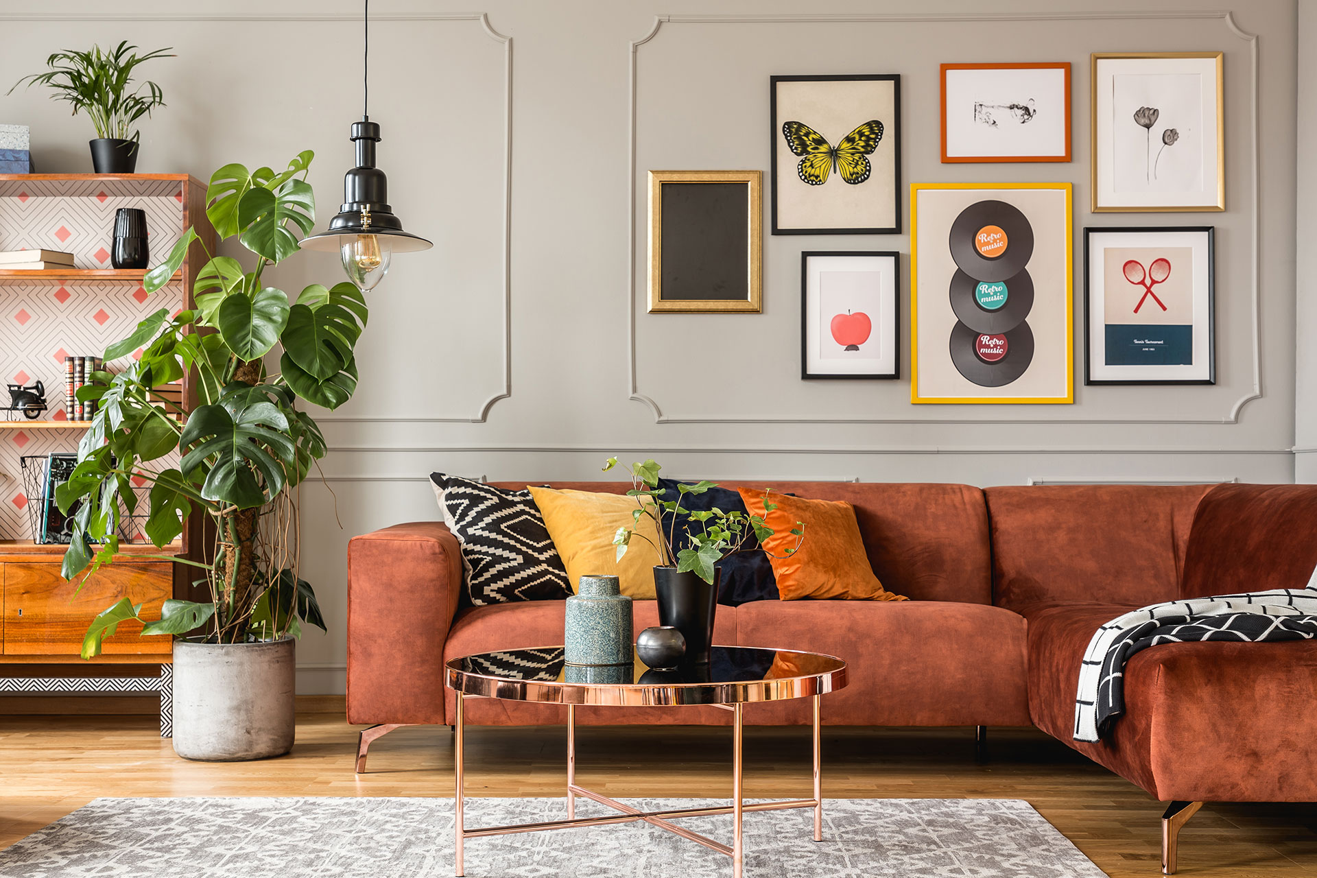
Getting your Christmas home decor aesthetic right is one of those things that sounds simple until you’re standing in your living room surrounded by bins of decorations, wondering why it all looks busy instead of beautiful.
I’ve seen this so many times — good pieces, real effort, and still that sinking feeling that something is off. The room feels cluttered rather than curated, festive in a chaotic way rather than the warm, intentional look you had in your head back in November.
I put this guide together because there’s a real difference between a home that looks decorated and one that looks designed, and it genuinely isn’t about spending more money. What you’ll find here are twelve specific, practical ways to build a cohesive holiday aesthetic — the kind that stops guests in the doorway — plus the honest mistakes that quietly cheapen even expensive pieces.
By the time you finish reading, you’ll know exactly where to start and what to leave in the bin.
How to Build a Christmas Home Decor Aesthetic That Looks Expensive Without Spending a Fortune

The secret nobody tells you? Cohesion costs nothing. Buying more stuff almost never fixes the problem.
I worked with a homeowner in Ohio last December who had spent close to $400 on new Christmas pieces and still hated how her living room looked. We pulled out about a third of what she’d put up, grouped the rest by color and finish, and the room transformed in under an hour. Not one new purchase.
That’s the core of a strong Christmas home decor aesthetic — deciding what belongs together before you decide what to buy.
Here’s where most people go wrong. They shop by individual piece rather than by palette. A copper lantern catches their eye in November, a plaid throw in early December, a set of bright red ornaments the week before Christmas. Each item is fine alone. Together, they fight each other.
Pick two to three colors max and stick to them across every room you’re decorating. That’s the actual rule. Not a mood board suggestion — a rule.
Then think about finish. Mix matte and shiny, but keep the metals consistent. Brass with brass. Silver with silver. The moment you mix gold, silver, and bronze in the same vignette, things start looking random even if the colors match.
Quick tip: Before putting anything out, lay every piece on your floor together — if it doesn’t look like a collection there, it won’t look like one on your shelf either.
1. Commit to One Cohesive Color Palette Before You Unbox a Single Ornament
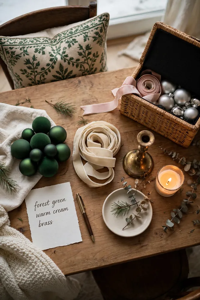
I always tell homeowners to do this step before they even open the first storage bin — and almost nobody does it.
Grab a piece of paper and write down two colors and one metal finish. That’s your whole palette. Not a mood, not a vibe. Actual colors with actual names. Forest green and warm cream with brass. Burgundy and blush with gold. Done.
Last year I helped a reader in Toronto who kept describing her style as “cozy and traditional” — but when we looked at what she’d put out, there were red ornaments, pink ribbon, silver candlesticks, and a gold garland all competing on the same mantel. Every single piece was pretty. Together they were noise.
The fix? We pulled everything off and sorted it by color on her dining table first. Anything that didn’t match the two colors she chose went back in the bin, no matter how much she liked it individually.
That sorting step is where your christmas home decor aesthetic actually gets built — not at the store, not online, but at your dining table with a pile of stuff and the willingness to say no to a few things.
Sound familiar? Most holiday decorating problems trace back to this one moment nobody talks about: the palette decision you never made.
Quick tip: Pull one item you already own — a throw, a pillow, anything you love — and let its colors choose your palette for you.
2. Layer Textures Instead of Adding More Pieces to Create That Luxe, Curated Feel

Texture is what separates a room that looks designed from one that just looks full.
I learned this the hard way in my own living room. I kept adding pieces — more ornaments, another candle, a second garland — and the space still felt flat. Took me two full seasons to realize the problem wasn’t quantity. It was that everything had the same smooth, shiny finish.
The fix is simple. Mix at least three different textures within the same vignette — something rough, something soft, something that catches light.
Think a chunky knit throw draped over a chair, a matte ceramic vase, and a metallic pillar candle grouped together. Same color family. Completely different surfaces. That combination does more for your christmas home decor aesthetic than doubling the number of pieces ever would.
What textures actually work well together?
- Velvet ribbon — soft, rich, and absorbs light beautifully
- Raw wood or bark — brings in an organic roughness that balances shiny ornaments
- Linen or burlap — neutral base that makes everything else pop
- Hammered metal — reflects light without looking plastic
You don’t need new pieces for this. Raid your regular home textiles — a waffle-weave hand towel, a wooden cutting board, even a stone coaster. Seasonal doesn’t mean bought-at-Christmas-only.
Quick tip: If your whole mantel catches light the same way, it’s missing texture — add one matte element and watch the whole thing settle.
3. Swap Plastic Ornaments for Matte, Mercury Glass, or Handblown Alternatives

Plastic ornaments are the fastest way to make a beautiful tree look cheap. I know that sounds harsh, but it’s true.
The problem isn’t color. It’s the surface. Plastic reflects light in a flat, artificial way that reads as dollar-store even when the ornament cost fifteen dollars. Your eye can tell the difference, even if your brain doesn’t immediately name it.
So what actually works? Three materials that photograph beautifully and look expensive in person:
- Matte finish ornaments — absorb light softly instead of bouncing it, which makes colors look richer and deeper
- Mercury glass — that aged, slightly cloudy silver look adds warmth and dimension that plastic simply cannot fake
- Handblown glass — slight imperfections are the whole point; they catch light differently at every angle
You don’t need to replace everything at once. Last year I swapped out just the front-facing ornaments on my tree — the ones most visible from the doorway — with matte and mercury glass alternatives. Kept the plastic ones toward the back. Cost me under $30 total.
The whole christmas home decor aesthetic shifted. Same tree. Same lights. Completely different feeling from across the room.
Quick tip: Shop matte ornaments in January when stores discount holiday stock — you’ll pay a fraction of the price for next season.
4. Style a Statement Mantel as Your Aesthetic Anchor and Build the Room Around It
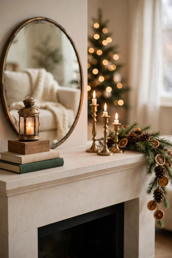
The mantel is the first place eyes land when someone walks into a living room. Get it right, and the rest of the room almost decorates itself around it.
I always start here before touching anything else — not the tree, not the coffee table, not the entry. The mantel first, every time.
Here’s why it matters so much. Once you nail a mantel that feels intentional and layered, you have a visual reference point to match everything else against. Same colors, same finish, same mood. The whole room starts pulling toward that one anchor.
So what does a strong mantel actually need? Three things working together:
- A tall centerpiece — a mirror, a wreath, or a large lantern that draws the eye upward
- Asymmetric layering — stack a few books or a wooden box on one side to create height variation, not a perfectly mirrored setup
- Something organic — fresh greenery, pinecones, or dried citrus slices break up hard edges and make everything feel less staged
Last December I restyled a mantel in under forty minutes using items the homeowner already owned. No new purchases. The change that did the most work? Removing two pieces, not adding any.
That’s the part people always resist. Editing feels like losing. But A mantel with five intentional pieces beats one with twelve competing ones every time — and that restraint is exactly what gives your christmas home decor aesthetic that pulled-together, expensive look.
Quick tip: Style your mantel in odd numbers — groups of three or five always look more natural than even-numbered arrangements.
5. Use Real or High-Quality Faux Greenery the Way Interior Designers Actually Do

Most people treat greenery like filler. They drape a garland across the mantel, maybe tuck a wreath on the door, and call it done. Interior designers do something completely different.
They use greenery the way you’d use a brush stroke — deliberately, in layers, at different heights. It’s never just one horizontal line across a surface.
I made the filler mistake for three years in my own home. Everything looked fine but flat. The shift happened when I started treating greenery as a structural element, not decoration. Suddenly the whole room had depth it never had before.
So what actually works? A few things worth knowing:
- Mix two greenery types — something dense like boxwood or pine, and something wispy like eucalyptus or cedar, which adds airiness
- Go vertical somewhere — a tall arrangement in a vase, or greenery draped down from a shelf edge, breaks the horizontal monotony fast
- Tuck it into unexpected spots — a sprig behind a framed photo, inside a lantern, around a candle cluster
On faux versus real: I’ve seen $12 real pine branches from a grocery store outperform $80 faux garlands every single time. The scent alone changes how a room feels.
If real isn’t practical, look for faux with varied branch lengths and natural color variation. Uniform, bright green faux greenery is the tell that quietly undermines a christmas home decor aesthetic.
Quick tip: Warm up faux greenery by tucking in a few real pine cones or dried orange slices — it reads as real from across the room.
6. Bring In Candlelight and Warm Amber Lighting to Replace Harsh Multicolored Strings
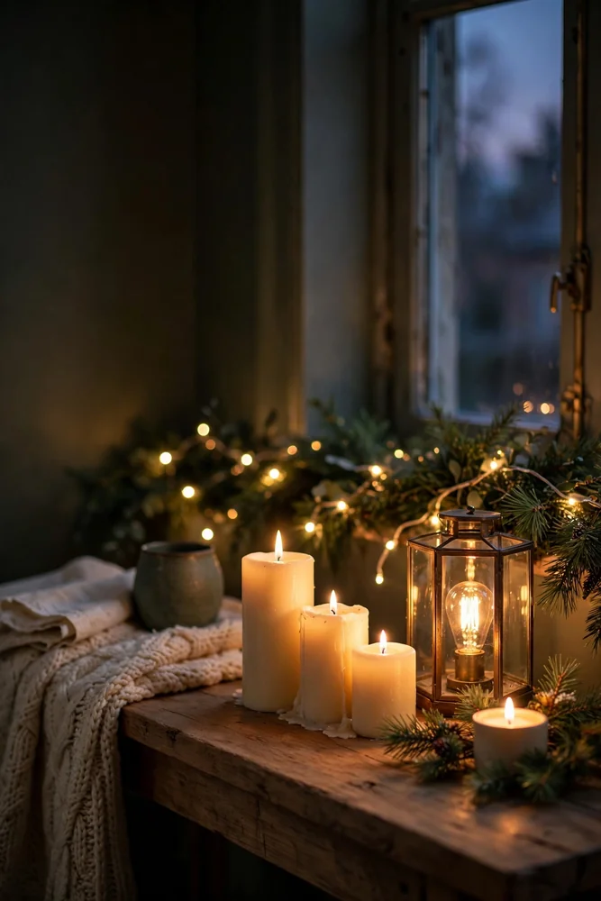
Lighting is the most underrated tool in holiday decorating. Most people hang their multicolored string lights, plug them in, and call it a room. But those flickering, clashing colors are quietly killing the mood they’re trying to create.
I switched my living room from multicolored strings to warm white LEDs three years ago and the difference was immediate. The whole space looked softer, calmer, and — genuinely — more expensive without a single new decoration added.
Here’s the thing about warm amber light. It behaves the way candlelight does. It flatters textures, makes colors look richer, and hides the small imperfections that bright, cool light exposes.
So what actually works beyond string lights?
- Pillar candles in clusters — group three at different heights rather than spacing them evenly across a surface
- Battery-operated candles — the flicker setting on quality ones is nearly indistinguishable from real flame, and they’re safe near greenery
- Small Edison-bulb lamps — placed low on a shelf or inside a lantern, they cast the warmest glow for the least money
Your christmas home decor aesthetic lives or dies by the quality of light hitting it. A beautiful mantel under harsh cool light looks flat. That same mantel under warm candlelight looks like a magazine photo.
Aim for 2700K or lower on any bulb or LED string you buy — that’s the specific number that gives you that warm, golden tone instead of clinical white.
Quick tip: Dim overhead lights completely when guests arrive and let candles and string lights do the work — the room instantly feels more curated.
7. Create Intentional Vignettes on Shelves, Consoles, and Coffee Tables Rather Than Decorating Every Surface
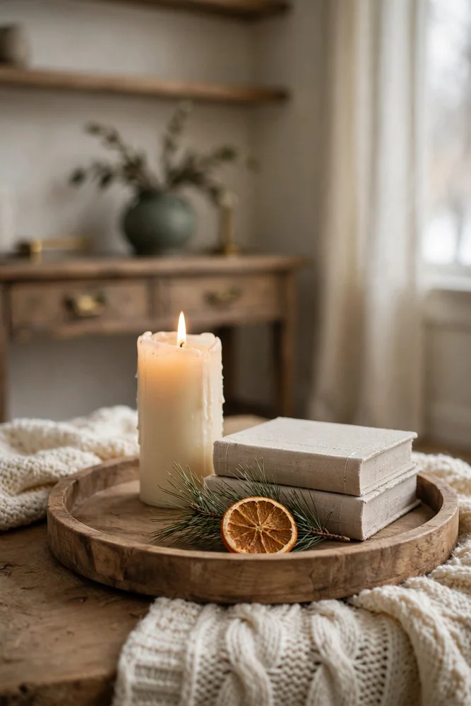
Most people decorate every surface they own. Every shelf, every console, every corner of the coffee table. And somehow the more they add, the less impressive it looks.
I used to do the same thing. Spread pieces across every available inch, thinking coverage meant festive. It just meant cluttered.
The shift happened when I started treating each surface as its own small scene — a vignette with a purpose — instead of a landing spot for whatever was left in the bin.
Here’s what a solid vignette actually needs. Three elements, different heights, one anchor piece that draws the eye first. That’s it. A tall candle, a small stack of books, and a sprig of greenery tucked in front does more for your christmas home decor aesthetic than twelve random pieces spread across the same shelf.
The rule I follow: leave one third of every surface empty. That negative space isn’t wasted — it’s what lets the eye rest and actually see what’s there.
On coffee tables, keep things low and grouped. One tray containing everything reads as intentional. The same items scattered across the table read as forgotten.
Consoles near entryways are high-visibility spots. One strong vignette there — something tall, something soft, something that smells good — sets the entire tone before guests even reach the living room.
Pick three surfaces max per room to style intentionally. Let the rest breathe.
Quick tip: Style inside a tray first — once it looks right contained, move the whole arrangement to the shelf exactly as is.
8. Incorporate Natural Elements Like Dried Oranges, Pinecones, and Bare Branches for an Organic Aesthetic Christmas Home Decor Look

Natural elements are the one category where free beats expensive every single time.
I started collecting pinecones from my backyard about four years ago — literally just picking them up off the ground — and they’ve ended up in more holiday arrangements than anything I’ve ever bought at a store.
Here’s what makes them work so well. They’re imperfect. Slightly different sizes, irregular shapes, that raw earthy smell. All of that irregularity is exactly what makes a vignette feel organic rather than assembled from a kit.
Dried orange slices are the other thing I reach for constantly. Slice oranges about a quarter inch thick, bake them at 200°F for four hours, and you have something that looks handcrafted and smells incredible. Drop a few into a bowl with pinecones and you’ve got a centerpiece.
Bare branches deserve more attention than they get. A tall vase with three or four dark branches — spray them with a light dusting of white paint if you want a frosted look — adds vertical drama that no store-bought piece can replicate for the same zero-dollar cost.
Where to use all of this?
- Inside a wooden bowl — mix pinecones, dried oranges, and a cinnamon stick for a coffee table centerpiece that looks curated and smells like Christmas
- Tucked into garlands — push a few cones and orange slices into a faux garland and the whole thing suddenly reads as real
- Clustered at candle bases — ring the bottom of a pillar candle with small cones and moss for an instant christmas home decor aesthetic upgrade
Quick tip: Seal dried orange slices with a matte Mod Podge coat — they’ll last the entire season without curling or browning.
9. Upgrade Your Tree Skirt and Topper Since They Are the First Things Guests Actually Notice

Most people spend hours decorating their tree and then throw on whatever skirt and topper they’ve had since 2009. Those two pieces are the first things guests actually clock when they walk toward the tree.
I did this for years. Beautiful ornaments, decent lights, and a shiny plastic star on top that made the whole thing look like it came from a gas station. Swapping that star for a simple linen bow cost me under $8 and the tree immediately looked like it belonged in a styled home.
The topper sets the tone from across the room. A floppy velvet bow, a bundle of dried cotton stems, or a simple cluster of birch branches all read as intentional in a way that a standard plastic star never does. Aim for something that matches your metal finish and doesn’t compete with the top third of the tree.
Tree skirts are trickier because people default to the cheap felt circle. Here’s what actually works better:
- A chunky knit blanket — drape it loosely instead of a perfect circle, which reads as styled rather than placed
- A wicker basket — slide the tree stand inside it completely; clean, minimal, and hides everything
- Linen fabric — gather and bunch it at the base so it looks relaxed, not rigid
That basket trick alone does more for your christmas home decor aesthetic than any new ornament set would.
Quick tip: If your topper leans or tips forward, hot-glue a small foam wedge to the inside base — it stays put all season.
10. Bring the Aesthetic Outdoors With a Front Entry That Signals the Mood Before Anyone Steps Inside
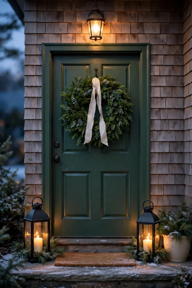
The front entry is the first impression. Full stop.
I’ve walked up to homes where the inside was beautifully decorated and the front door looked like nobody lived there — a sad wreath, some dying mums in a pot, and a porch light that stayed on all day. All that work inside, completely undercut before anyone even knocked.
Your entry needs three things working together: something at eye level, something low, and something that creates a scent or sensory moment. A wreath on the door, a pair of matching urns or lanterns at the base, and a handful of real pine clippings tucked into both.
That pine smell when someone walks up? It does more for your christmas home decor aesthetic than any decoration you put inside.
Lanterns are the easiest upgrade here. A set of two matte black or aged bronze lanterns flanking the door, each with a pillar candle inside, makes a porch look intentional rather than thrown together. I picked mine up at a thrift store for under $14 total and they’ve been outside every December since.
Keep the color palette consistent with what’s inside. If your living room is forest green and cream, bring that outside too — green wreath, cream ribbon, maybe a cream-colored pot. Same aesthetic, no disconnect when the door swings open.
Don’t decorate the whole porch. One strong moment beats six scattered ones.
Quick tip: Swap your regular doormat for a simple natural coir mat — it grounds the whole entry and reads as styled without a single holiday-specific purchase.
11. Edit Ruthlessly — Cute Christmas Home Decor Looks Most Expensive When There Is Less of It
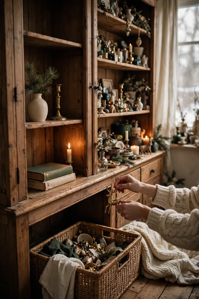
Editing is the skill nobody wants to practice. Adding feels productive. Removing feels like failure. But I promise you — the homes I’ve styled that stopped people in their tracks were almost always the ones where I took things away.
Last December I walked into a reader’s dining room that had decorations on every surface, every windowsill, every inch of the hutch. She’d spent months collecting pieces she genuinely loved. The room looked like a holiday clearance sale.
We pulled out roughly half in forty minutes. Same pieces, same room. Completely different feeling.
Here’s the editing rule I follow now. Pick up each piece and ask one question: does this add to the vignette, or does it just fill space? If the honest answer is “it fills space,” it goes back in the bin. No negotiating.
Negative space isn’t empty. It’s breathing room. It’s what lets the eye land on the pieces you actually want noticed.
The christmas home decor aesthetic that reads as expensive is almost always the quieter one — fewer pieces, more intention, nothing competing for attention at the same time.
A common mistake? Keeping something out because you paid good money for it. Cost has nothing to do with whether a piece belongs in this year’s setup. If it breaks the palette or crowds a vignette, it goes.
Ruthless editing is free. It costs you nothing except the willingness to let go of pieces that don’t serve the whole.
Quick tip: Box up anything you’re unsure about and live with the room for a day — you’ll almost never go back to add it in.
12. Lean Into a Signature Scent to Complete the Sensory Aesthetic Most Decorators Forget

Scent is the one thing that hits before anyone even looks around the room. You can have the most beautiful mantel, a perfectly styled tree, and candlelight everywhere — and a bad smell (or no smell at all) undercuts every bit of it.
I figured this out after hosting Thanksgiving and Christmas back to back one year. The decor was the same both times. But Christmas felt different — warmer, more magical — and the only real change was that I’d been simmering a pot of orange peel, cinnamon sticks, and cloves on the stove all afternoon.
Guests mentioned the smell before they said a single word about the decorations.
Pick one signature scent and commit to it the way you commit to a color palette. Not three candles in different fragrances burning at once. One. Layered consistently across the room.
What actually works well together:
- Simmering stovetop pot — orange slices, cinnamon, star anise, and a splash of vanilla extract in water; costs almost nothing and fills the whole house
- Single-fragrance soy candle — balsam, cedar, or clove; one scent, not a medley
- Real pine clippings — tuck a few fresh branches near a heat source and they release scent naturally all day
This is where your christmas home decor aesthetic crosses from visual into something people actually feel. The rooms that guests remember aren’t just the ones that looked good.
They’re the ones that smelled like Christmas.
Quick tip: Simmer your stovetop pot for thirty minutes before guests arrive — the scent peaks right as they walk through the door.
Common Mistakes That Make Christmas Decor Look Cheap No Matter How Much You Spend
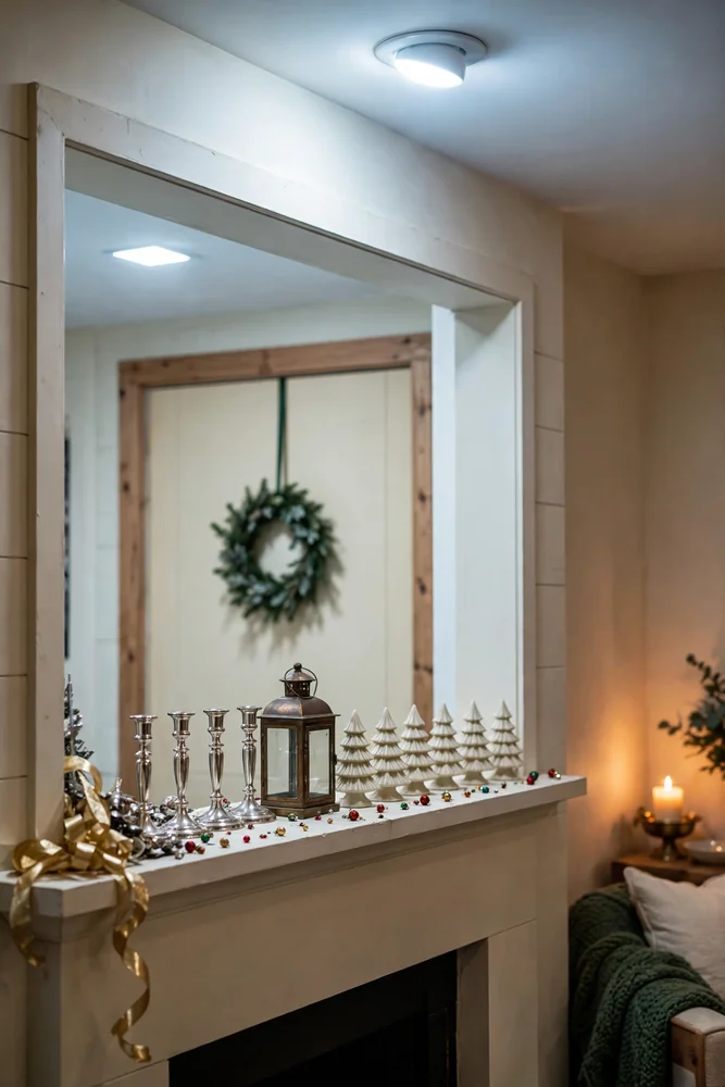
These show up constantly, and they cost people more than they realize.
The biggest one? Mixing too many metals. I see this in almost every home I walk into — gold ribbon, silver candlesticks, bronze lantern, all within three feet of each other. Each piece is fine. Together they look like a clearance bin.
Pick one metal and protect it like a rule, not a preference.
Second mistake: scaling too small. A wreath that’s too tiny for the door, candles that disappear on a wide mantel, ornaments so small they read as scattered dots from across the room. People shop without measuring and then wonder why nothing has presence.
Third, and this one quietly ruins more rooms than anything else — leaving overhead lights on. Bright ceiling lights wash out every warm, curated thing you’ve done. The candles disappear. The texture flattens. The whole christmas home decor aesthetic collapses under fluorescent glare.
Turn them off. Every time.
A few other patterns worth naming:
- Decorating every room equally — spread thin beats focused every time; pick two rooms and do them well
- Using too many themed “sets” — matching collections look assembled, not curated; mix in individual pieces
- Ignoring the ceiling and floor — a bowl on the floor, a hanging ornament cluster overhead — these levels are what make a space feel layered
Sound familiar? Most of these cost nothing to fix. They just require noticing them first.
Quick tip: Walk out your front door and re-enter your own home like a guest — you’ll spot the mistakes in under sixty seconds.
Final Thoughts: The Aesthetic Christmas Home Decor Shift That Changes Everything
Here’s the shift that actually matters: stop decorating and start editing.
Every tip in this guide points back to the same thing. Less, but intentional. Two colors. One metal. Three surfaces. A single signature scent. The homes that stop people mid-step aren’t the ones with the most — they’re the ones where everything that stayed earned its place.
I used to think more effort meant more pieces. More pieces meant more festive. It took me an embarrassingly long time to realize the rooms I actually loved in magazines were the ones with breathing room in them.
Your christmas home decor aesthetic doesn’t get built at the store. It gets built at your dining table, with a pile of what you already own, and the willingness to put half of it back.
Start with one anchor — your mantel, your tree, your entry. Nail that first. Then let everything else respond to it. You won’t need twelve surfaces decorated. You’ll need three done well.
That’s genuinely it. One palette, one metal, one scent. Repeat it across the rooms you care about. Edit anything that doesn’t belong.
The homes guests remember in January aren’t the ones with the most ornaments. They’re the ones that felt like somewhere someone actually lived — warm, considered, and a little bit magic.
You already have most of what you need to get there. You just need to leave some of it in the bin.